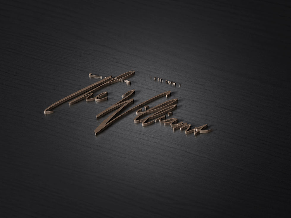
ST. REGIS | THE WILLIAMS
Overview
“The Williams is a cafe restaurant in the grand European tradition, a blend of the grandeur and luxury of a European cafe with the sensibilities and spirit of a Californian restaurant.” – Achim Lenders
Challenge
“City by the bay, Legacy, Signature Elements” were the three concepts of inspiration given to MUSE. From those abstractions, MUSE was to create an entire visual brand identity. The new identity required a versatile creative that would be implemented across all restaurant materials.
Solution
“The Williams, a place to witness and inspire Leaders and Influencers to leave their visionary mark.” MUSE used Ink, copper and purity to create an elegant cohesive visual brand identity that was confident like San Francisco, as timeless as a legacy, and pure like every signature element.
MUSE developed a design system based around ink, the primary graphic device, that would personify the idea of the “visionary mark”. Copper and purity were graphic accents that accompanied the ink. Copper stands for class and perfection, where purity was highlighted with the straight-forward beautiful menu items made with only the finest local ingredients. Many things in life are best kept simple and food is one of them.
 |  |  |  |  |  |
|---|---|---|---|---|---|
 |